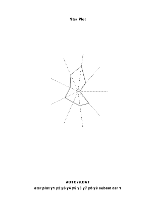
A star plot is a method of displaying multivariate data, each star representing a single observation. It is used to examine the relative values for a single data point and to locate similar points or dissimilar points.
A stem and leaf plot is a method used to organize statistical data. The greatest common place value of the data is used to form the stem. The next greatest common place value is used to form the leaves. This is a stem and leaf plot showing the different ages of people present at a given family reunion.
A box plot is a great visual aid to examining key statistical properties of a variable, it is a graphical representation of data that shows a data set's lowest value, highest value, and the size of the first and third quartile. This box plot compares four machines for energy output.
A histogram is a display of statistical information that uses rectangles to show the frequency of data items in successive numerical intervals of equal size. Here is a histogram showing the amount of wheat produced in Australia in its different regions and over the years.
A parallel coordinate graph displays multiple different data thanks to parallel coordinate axes connected by overlapping lines. Here is actually a 3D parallel coordinate view of all cells of an embryo and of nine selected genes.
A windrose is a diagram that shows the frequency and strength of the wind from various directions and for a given area. This is a windrose reprsenting the wind blowing over the Wilkes-Barre/Scranton International Airport, Pennsylvania.
A climograph is a graph that shows the climate of a given region by showing average data of temperature, precipitation, etc. This is a climograph representing the forecasted temperature and precipitation over a whole year in the Pacific Island named Guam.
A graph that shows the climate of a specific region, by showing average data oThperature, precipitation, etc
The Lorenz curve is a graphical representation of wealth distribution. The more the Lorenz curve is bent the more unequal the wealth distribution is. The line of perfect equality shows the ideal distribution.
A bilateral graph is a graph that displays two data on the same graph. This is a graph showing both the change to meet Kyoto targets from projected emissions for 6 big world power and from current emissions.
A nominal area choropleth map is a type of choropleth map that only use nominal data in order to display a phenomena. This is a nominal area choropleth map showing the number of people living in poverty in America.
An unstandardized choropleth map is a type of choropleth map that has not been areally average. This is an unstandardized choropleth map of the total fertility of the different world's countries between 2000-2005
A standardized choropleth map is a type of choropleth map that has been areally averaged. This is a standardized choropleth map of the 2006 Canadian percentage of population aged 14 years and under.
http://www.colocarto.com/custom-thematic-maps.html
An univariate choropleth map is a type of choropleth map that displays only one phenomena at a time. This one shows the 2008 American estimated household income.
An unclassed choropleth map uses continuous grade change in color in order to represent a range of values. This unclassified choropleth map shows the fertility rate in Europe in 2002.
A classed choropleth map is a map that uses ranges to show different classes. This classed choropleth map shows the homicide rates in deaths per 100000 in the US between 2001 and 2005
Range graded proportional circle map is a type of map that uses circles in order to show the value of a given data in a given area, the size of the circles vary according to the value of the data. This range graded proportional circle map shows the 2008 number of EID events in the World.
A continuously variable proportional circle map is a proportional circle map in which the size of the circles are relative to the data collected for a given area. This is one of the first continuously variable proportional circle map, it is from the 1850's and was created by Charles Joseph Minard in order to show the different types of meat sent to Paris butcheries from different french regions.
DOQQ stands for Digital Ortophoto QuarterQuadrangles, it combines the image characteristics of a photograph with the geometric qualities of a map, it is a digital aerial photography. This DOQQ was taken in the state of South Carolina.
DEM stands for Digital Elevation Map, it is the digital representation of the elevation of a location on the land surface. Here is a digital representation of the elevation of Milparinka and Cobham Lake, New South Wales, Australia.
DLG stands for Digital Line Graphs, it is a digital representation of the features displayed on a US Geological Survey topographic map. Here is a Digital Line Graph map of Beaufort, South Carolina.
A DRG stands for Digital Raster Graphics, it is a scanned image of a US Geological Survey standard series topographic map, that includes all map collar information. Here is a DRG of a part of the Washington West, D.C.
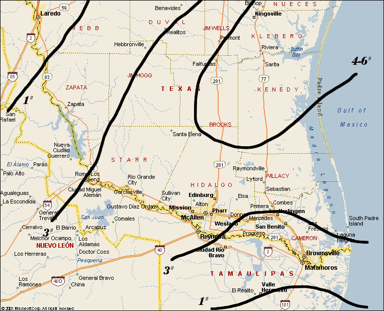
An isopleth line is a line on a map that connects points of equal value of some measurable quantity. Here is an isopleth map showing the snowfall in South Texas and the lower Rio Grande valley.
Isohyets are lines on a map that connect points of equal amount of rainfall. Here, represented with the help of isohyets, is the Hong Kong rainfall distribution between September 10 and 12 of 2002.
Isotachs are lines that connect points of an equal wind speed in a given area. This map gives wind information thanks to isotachs over a bit more than the western half of the United States.
Isobars are lines of equal atmospheric pressure drawn on a meteorological map. Isobar maps are maps that show different isobars, therefore different atmospheric pressure, in an area. This is an isobar map of the United States, the highest wind speeds are located where the isobars are the closest from each others.
LIDAR stands for Light Detection And Radar, it is a technology similar to radar that uses lasers to determine the distance between objects. Here is a 2001 LIDAR image of lower Manhattan, New York.
Doppler radar tracks the motion of clouds by pulsing atmosphere with microwave radiation and then measuring the attenuation in the return pulse to calculate the cloud’s reflectivity and velocity. Here is a reflectivity image from the Doppler radar in Frederick, Oklahoma. The colors represent the strength of returned energy to the radar, it is expressed in decibels.
Black and White aerial photographies give a much better idea of the texture of the ground than maps do , they are often use for when the surface features are studied and help sometimes to create maps. Here is a 1966 black and white aerial photography of Oswestry, England.
An infrared aerial photography can be hard to interpret. The fact that it is infrared changes the color that we are familiar with, it is often used to represent vegetation. Colors change from the natural color we are used to after the photography is infrared and then each color has a special meaning. Here is a 1995 infrared aerial picture of the Lyndon B. Johnson National Historical Park in Johnson city, Texas.
A statistical map is used to show the variation quantity of a given factor in a specific geographic area, it uses percentages most of the time. A statistical map is used here by the American National Agricultural Statistics Service in order to show the number and the distribution of farms throughout the country in 2002.
A cartogram is used to show quantitative information by a simplified map where scale isn't usually respected. Here the London government website uses a cartogram in order to show the London population's vote trends for the 2012 Mayoral Elections of the English capital.
The flow map is very helpful to describe and analyze a process. Flow map often refers to movement, most of us are familiar with flow maps thanks to the different trades maps. Here is the world beef trade flows in 2007.
An isoline map is a map with continuous lines that serve to join points of the same value, it is often used by meteorologists in order to show weather phenomenon. Here is the winds forecast, this kind of phenomenon doesn't follow lines that we are familiar with or logical lines, for example the wind speed can be the same in Pennsylvania and in only half of Ohio (as shown on this map). Isoline maps are very useful to display this kind of situation.
A choropleth map is a map where areas are shaded or patterned in fonction of a given theme, it is often used to display information such as population density or even per-capita income. This map shows the forecast of change in jobs in the United States between 2009 and 2010
A dot distribution map is a type of map that uses dots to represent the presence of a feature, of a quantity or a phenomenon . It is often used to show populations in a specific area. Here is a dot map representing the total distribution of the Hispanic population in Los Angeles. A blue dot represents a loss of 150 hispanic persons, a red dot represents the gain of 150 hispanic persons.
Propaganda mapping is creating a false map in order to display specific ideas. It is very similar to propaganda but through the mean of mapping. Here, as the title says it, it is a map of Europe seen from Russia. From this angle, western Europe seems very week next to Russia. It looks vulnerable, like a dead end without an exit from the Russian power. Russia is doing propaganda through the use of mapping here, they are displaying the idea that they are the strongest power of Europe.
A hypsometric map is a map giving elevations information by means of contours, shading, tinting and/or batching. Here is a hypsometric representation of the Pyrénées, a mountain chain between France and Spain. The elevations are clearly shown here thanks to contours and shading. The mountain chain is along the boarder, represented here by a red line. We can see the elevation is more important there than a bit up north.
A PLSS map is used to show division for public domain land (lands own by the government for the benefit of its citizens). Here on the map is a portion of township of the Public Land Survey system that covers part of the Opalene Guich quadrangle.
Cadastral mapping is one of the most ancient forms of mapping, it is designed to show boundaries and relationships between parcels of land. Here this maps shows the property ownership boundaries for the Aclands and their neighbours. Sir Thomas Dyke Acland was a british politician and baronet.
A thematic map displays the spatial pattern of a social or physical phenomenon, such as population density, life expectancy or climate change. The thematic map above shows how may new businessess saw the day in 1999 (in 48 of the American states). We can see for example that in 1999, between 1001 and 7000 new businessess were created in the West Palm Beach (Florida) area.
A topographic map is a map showing natural and/or physical features of a landscape, including altitude contours and so by means of countour lines. A reference point is used so that ground elevation or vertical elevation towards this point can be represented. Here the topographic map is the representation of an isolated hill. The reference point used is sea level
A planimetric map is a map indicating only the horizontal positions of features without regard to elevation. Typical scales are 1 inch= 100 feet and 1inch= 200 feet.
This is a mental map. This is something we are all familiar with, humans remember information about places and a mental map is the interpretation of what they remember. Every single mental map is different. We use it everyday to find our own way or to give directions to someone else. Here we can see the person who drew showed her old house, her new one, the school nerby... This are information that might have not been displayed if it was someone else drawing their mental map about the exact same place.


